OnPoint Concept
  • HOME
  • BRANDING
  • PACKAGING
  • PRINT
  • CONTACT
  • Menu

Our BRAND  IDENTITY solutions begin with developing the perfect strategy to create a clear voice for your branding. We then execute the best on-point concept that hits the mark.

Our BRAND IDENTITY solutions begin with developing the perfect strategy to create a clear voice for your branding. We then execute the best on-point concept that hits the mark.

Dressage Flow System

FOR THE DRESSAGE AFICIONADO

To reach dressage riders and followers, DRESSAGE FLOW required a brand identity that signified the grace of dancing with horses—something that suggested the smooth flow of dressage perfection—and able to stand the test of time.

DRESSAGEFLOW WEBSITE

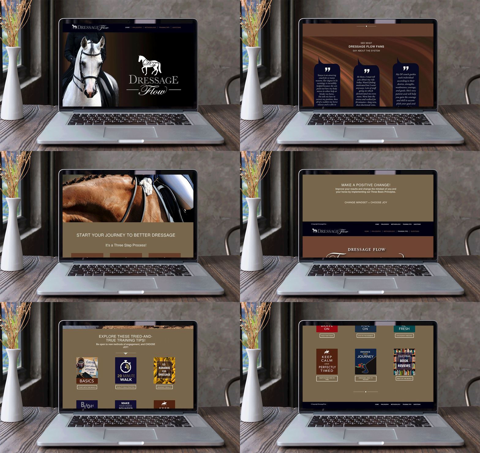
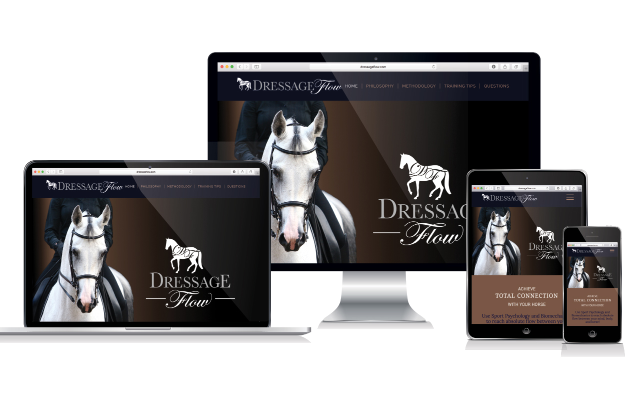
An easy-to-use website that presented classical riding material in a straightforward manner, was a priority.

We created this extensive responsive website, with more than 20 pages of practical educational material and training tips, to enlighten the dressage enthusiast.

View the live site here:

www.dressageflow.com

BUSINESS CARDS & PROMOTIONAL MATERIALS

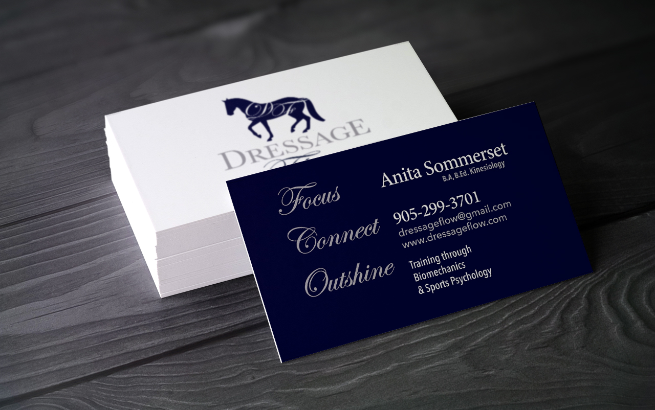
Double sided business cards highlight the three Dressage Flow Basics: “Focus, Connect, Outshine”.

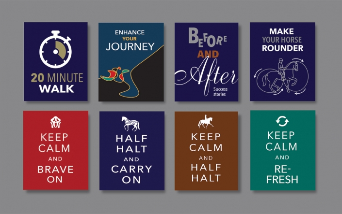
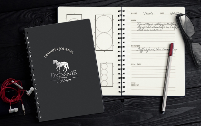
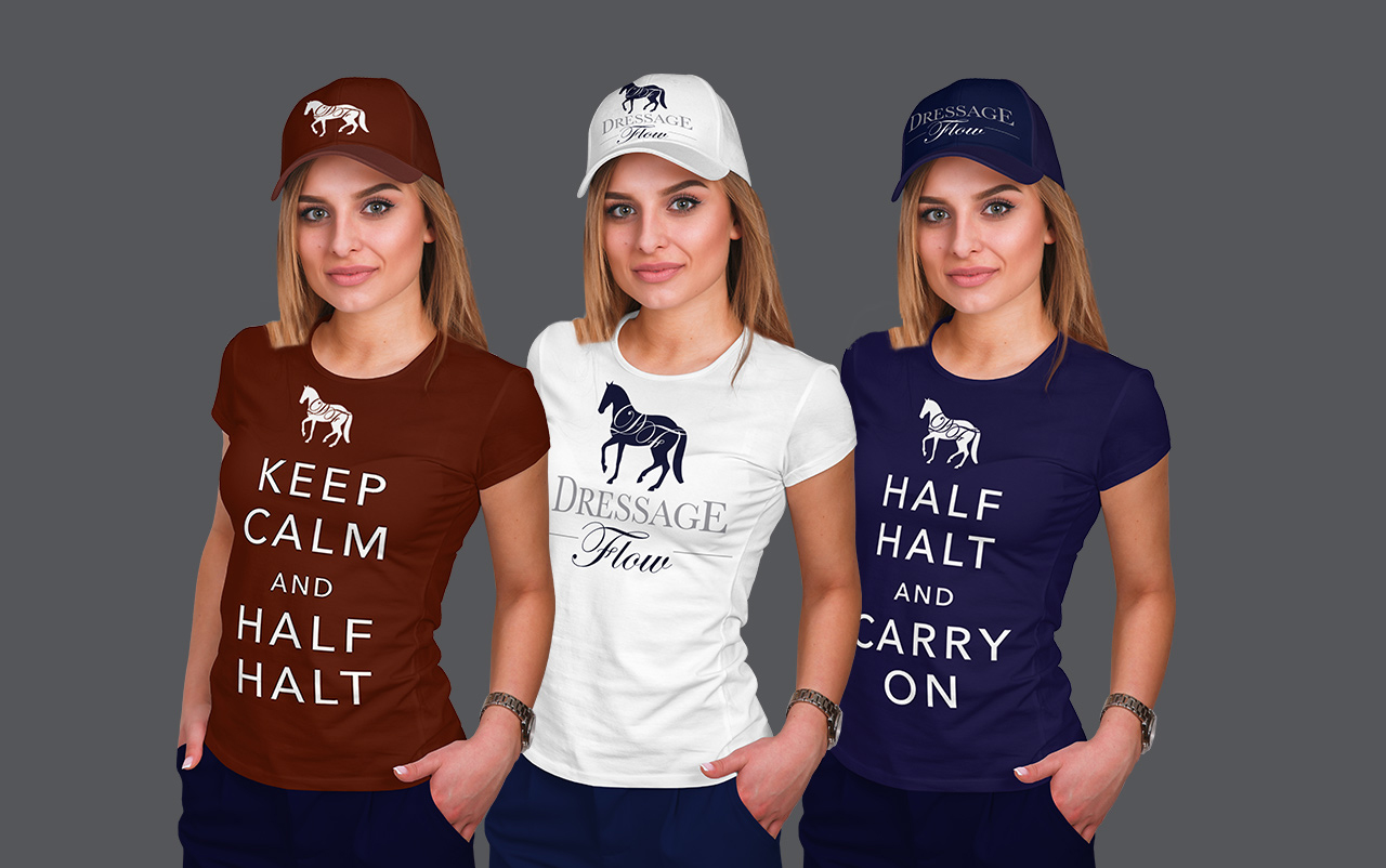
Posters, T-shirts, training journals, and other materials promote her system at shows and clinics.

PreviousNext
12

HugoMark Construction

HUGOMARK CONSTRUCTION

HugoMark is a unique construction company engaged in large projects such as bridges, roads, tunnels, concrete structures and repair. They deal with both the public and private sector.

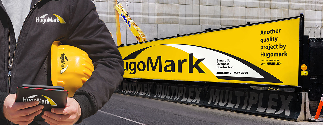
Their goal for the next 2 years was to increase market share by 10%. To reach their target, Hugomark recognized they needed a new image for their marketing strategy to reflect growth. The logo reflected their predominant work with bridges, by using a span graphic over the type, while yellow and black signifies a serious construction company. The result was a strong, solid brand identity that was strategically on point.

HUGOMARK CONSTRUCTION BRANDING

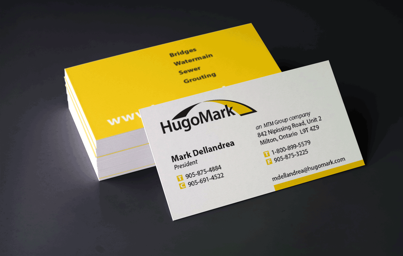
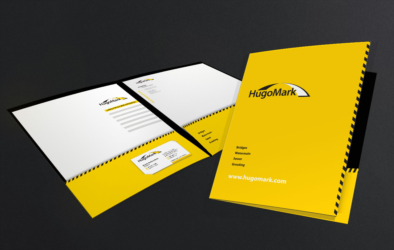
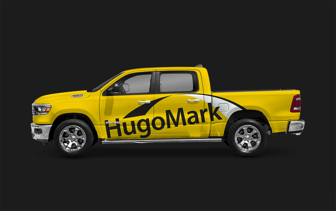
The complete system of their new branding included a responsive website, business cards, client project folders, trucks, and signage for construction sites. The proposal for their website is ongoing.

PreviousNext
12

ALTERNATE HUGOMARK LOGOS

Aislinn Dressage

AISLINN TRAINING FACILITY

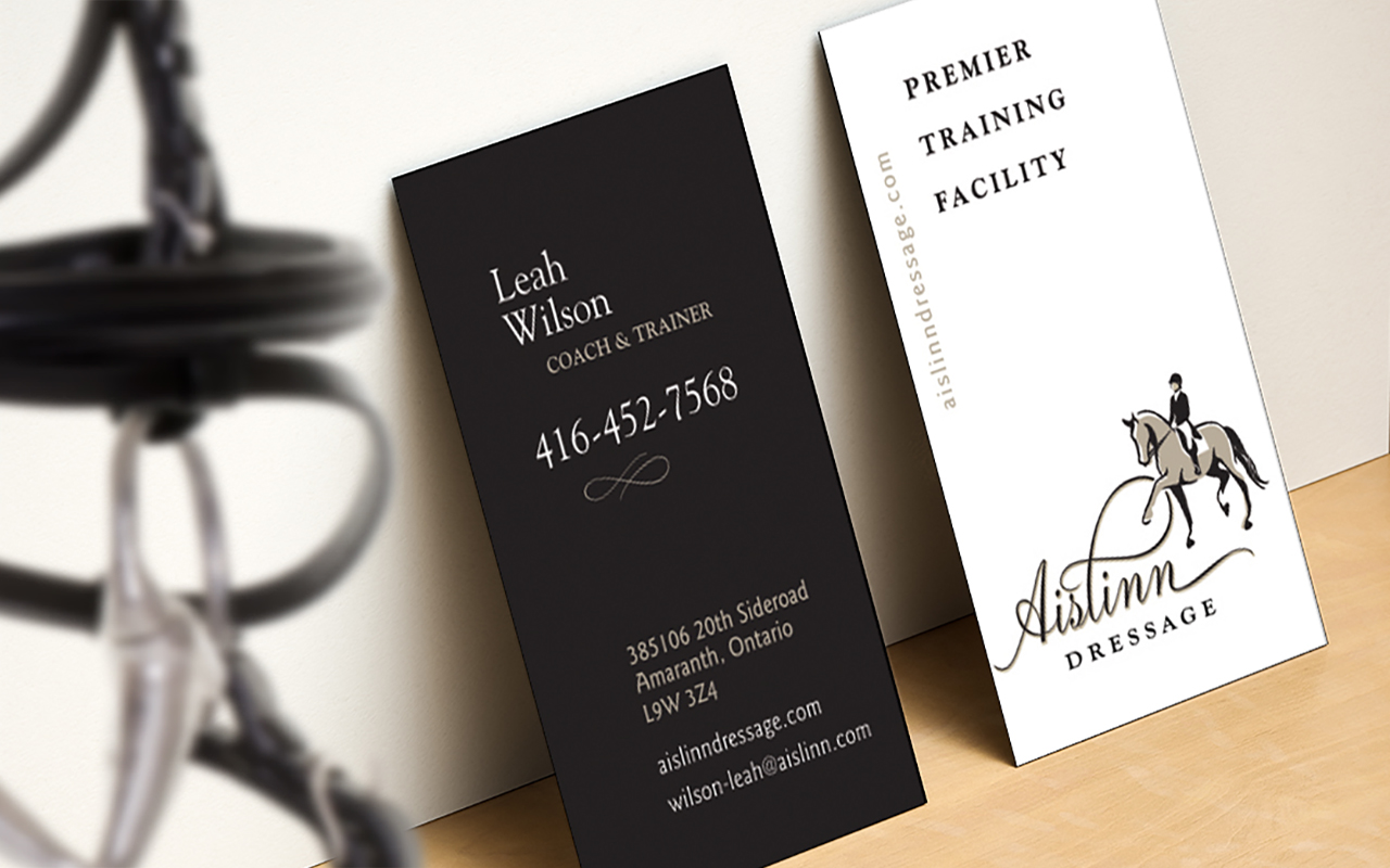
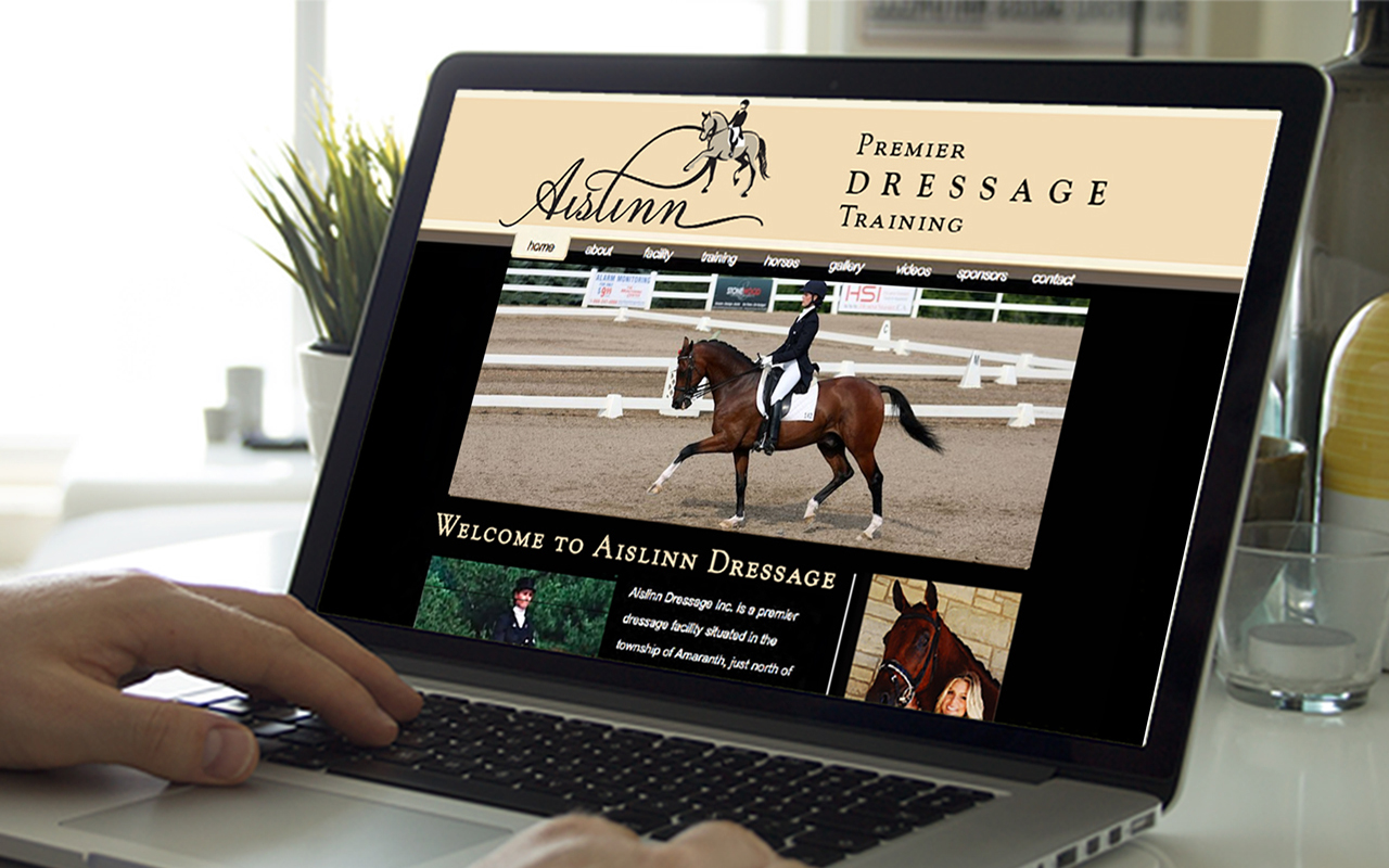
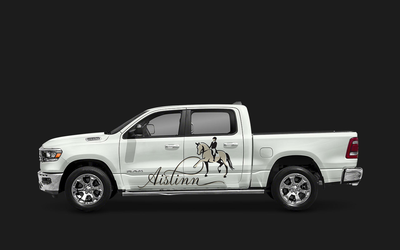
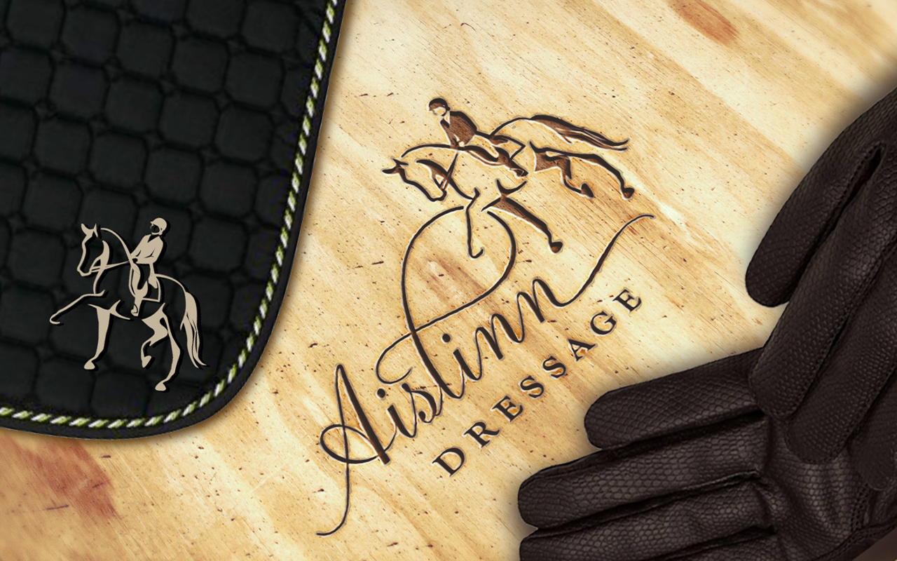
Dressage show barn, Aislinn, approached us for a brand identity, since owner and trainer Leah Wilson, was moving up the ranks into the Olympic Games. She needed an identity with elegant movement that implied the graceful choreography of dressage horses. It was essential that it be upscale and memorable, since she travels internationally for horse shows.

AISLINN DRESSAGE BRANDING

Working with Leah’s existing barn colours (tan, black, and a hint of pale blue), her new identity needed to echo her impressive upscale barn and stunning dressage horses.

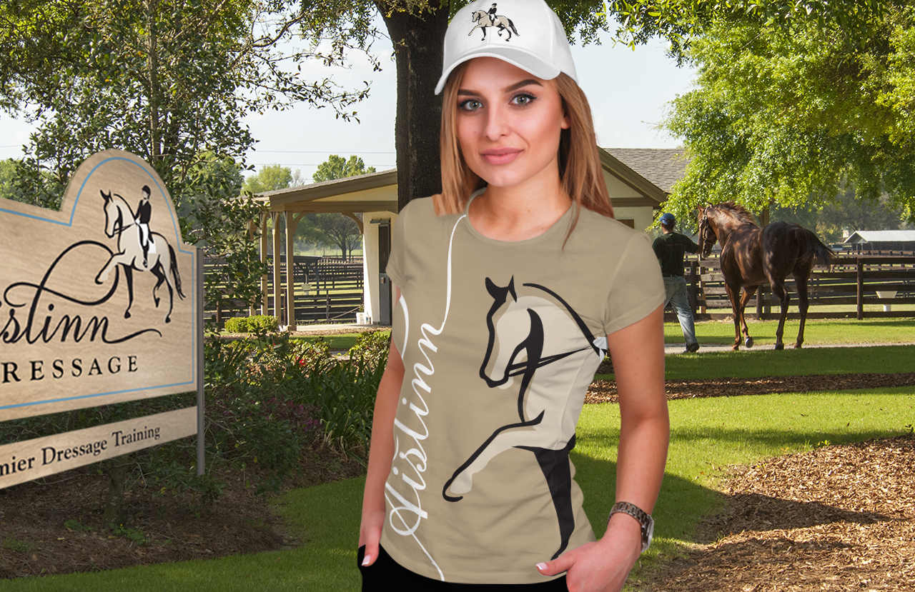
The implementation of their branding extended to website, business cards, riding wear, saddle pads, vehicles, and signage.

PreviousNext
12

ALTERNATE LOGOS

Logos

MORE BRANDING

The equestrian industry has been a focus of our branding work, since Dawn Lambert is actively involved in the industry.

She has worked with equal success on projects from the motorcycle and automotive industry to American Express, Purina, Christie, Chateau-Gai, and National Sports, etc. Her range is far reaching, and ON POINT.

BAHR SADDLERY

Bahr’s required a simple logo and mark that encompassed all riding disciplines—Hunter, Jumper, and Dressage. The proposed use of a single horse graphic embedded in the initial ‘B’, was the perfect solution.

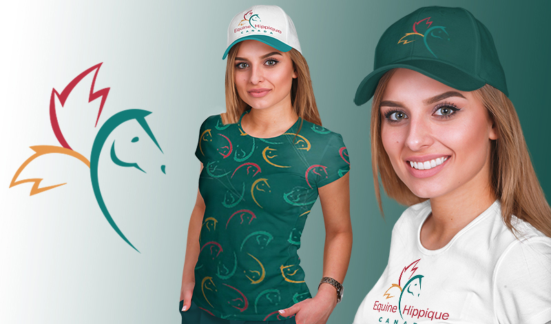
EQUINE CANADA

Equine Canada, a national organization, required a new identity in 2004 that spanned over all equestrian disciplines. It was important to communicate ‘Canada’, for its global presence in international events and competitions, including the Olympics and PanAm Games.

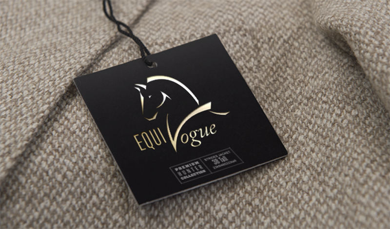
EQUIVOGUE

Equivogue created popular riding wear for equestrians of all ages and disciplines. In the symbol, the ‘V’ evoked a Champion ribbon around the neck. A real winner!

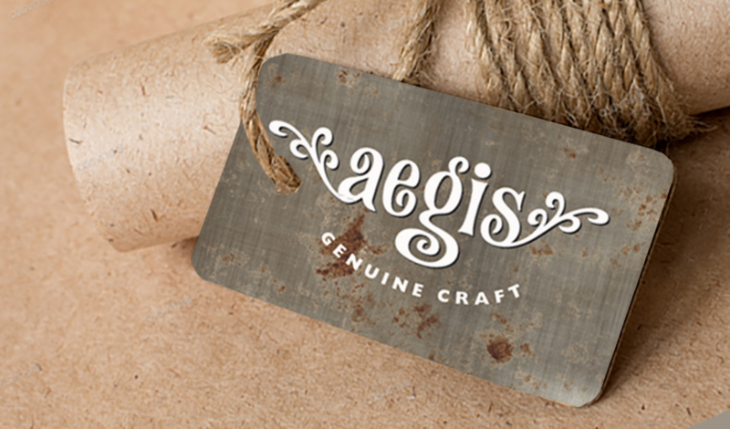
AEGIS GENUINE CRAFTS

Aegis is an artisan crafts business that sells unique jewellery at events and online.

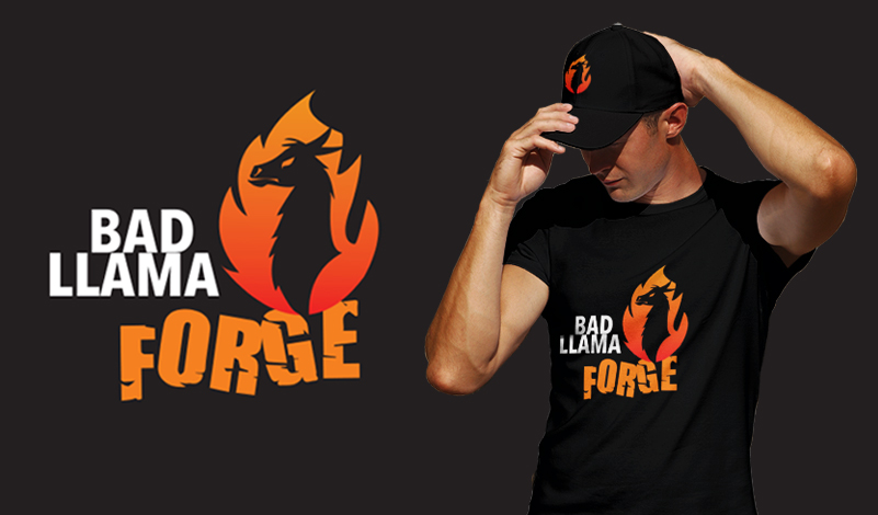
BAD LLAMA FORGE

A unique blacksmithing forge logo uses the popular icon of a llama, since the owner’s llama, Llouie, is a curious mischievous mascot.

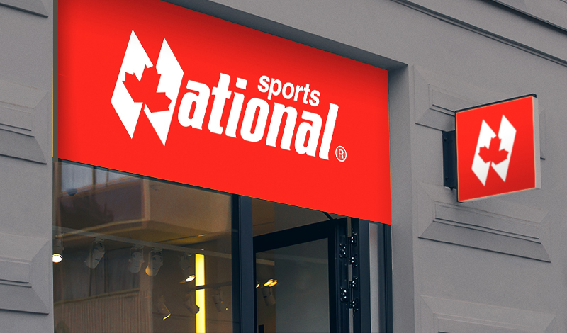
NATIONAL SPORTS

National Sports required branding that was simple, sporty, and most importantly, Canadian.

GO TO PACKAGING GO TO PRINT
HOME CONTACT
© Copyright – OnPoint Concept 2020 | Disclaimer
Scroll to top